Over the years our signature tree logo (and that cheeky bird*) became a beloved part of the company’s identity, and we’ll be forever grateful to Carrie Klassen for creating our very first brand as a fledgling collective.
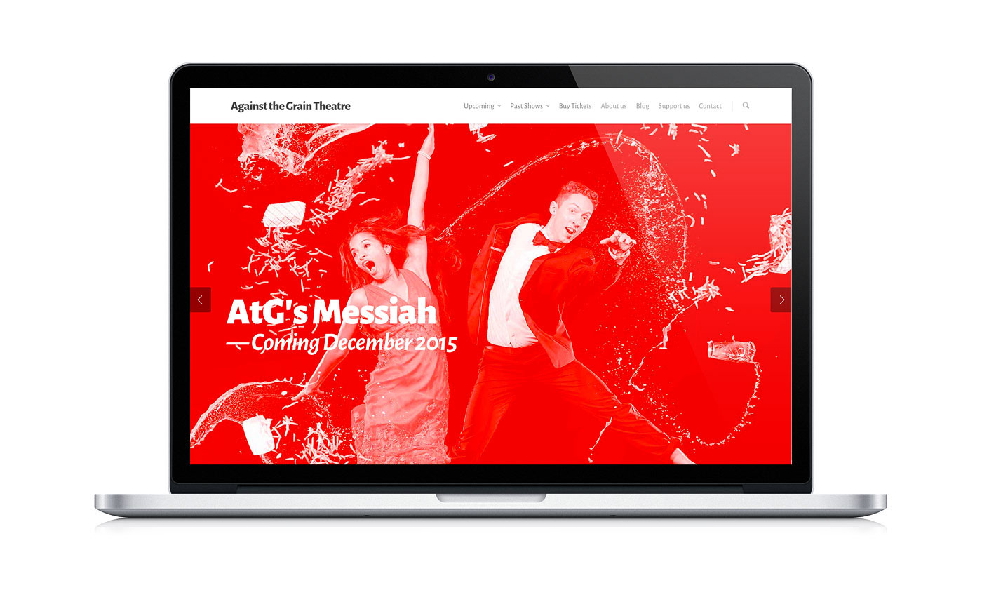
AtG is growing and evolving, and with that comes a visual refresh. Michael Barker of Acme Art & Design put on his thinking cap and set out to capture the essence of who we are and what we do. The good news was that the members of the AtG collective share great taste (and loads of modesty, obviously) and we came to some conclusions fairly quickly about what we want to communicate to the world through our brand.
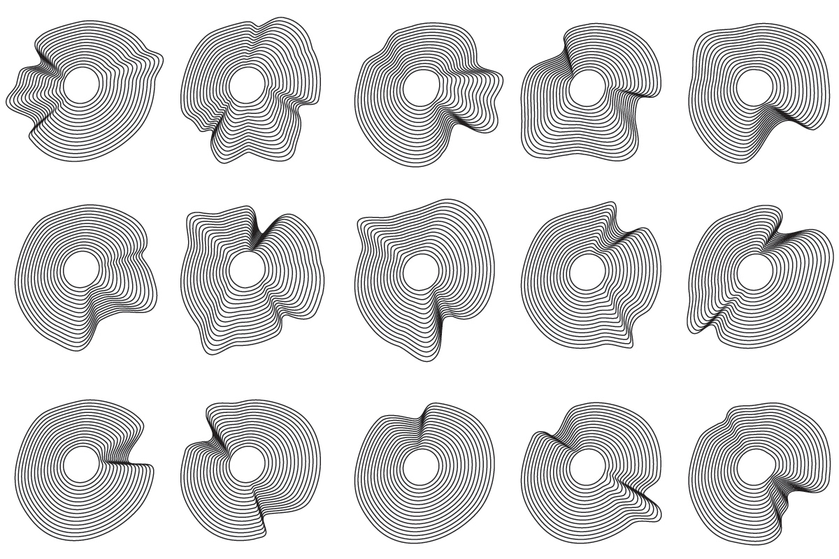
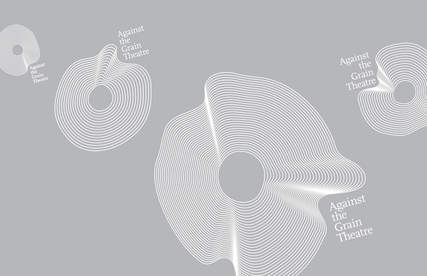
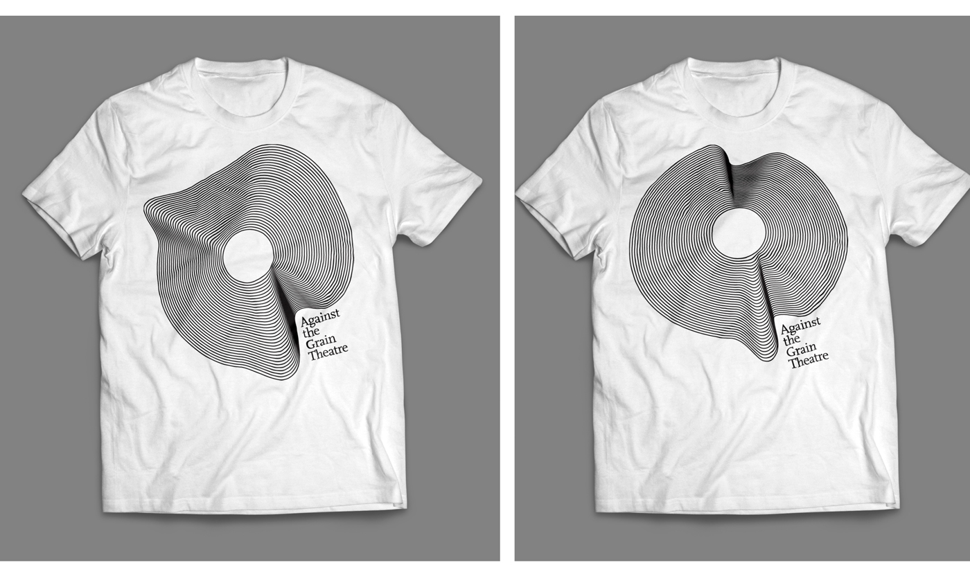
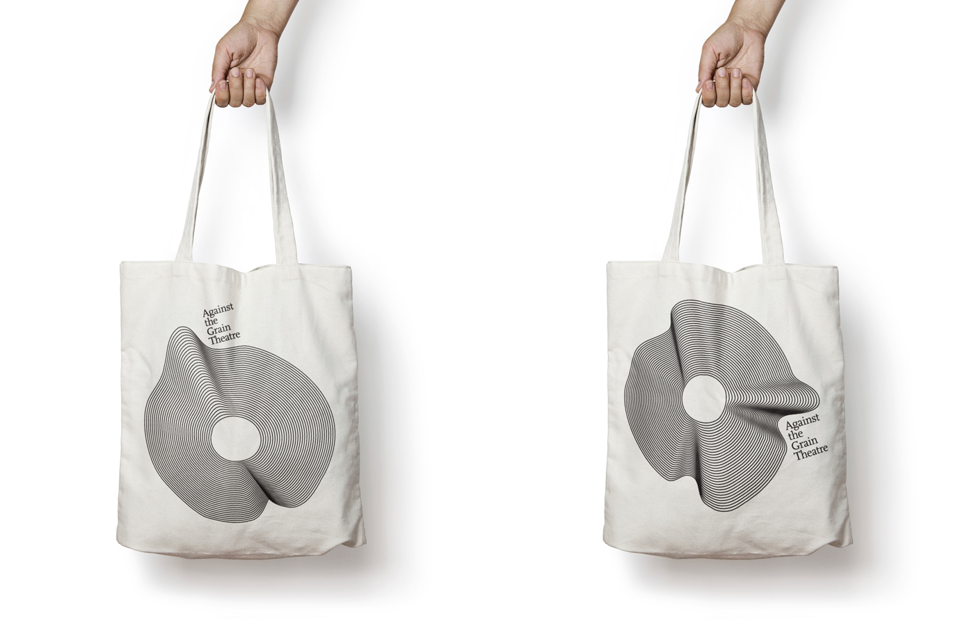
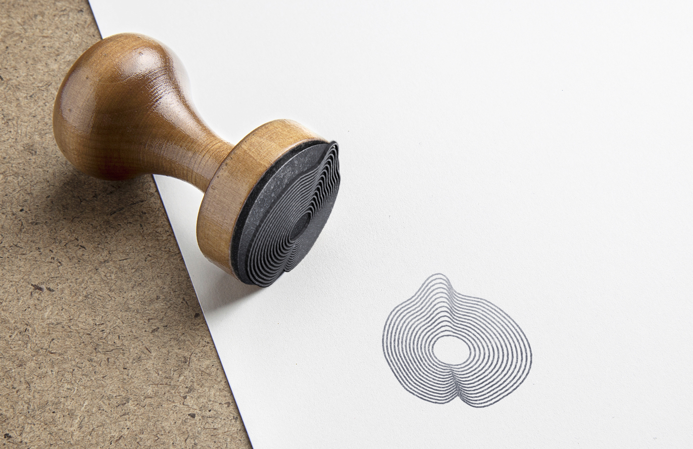
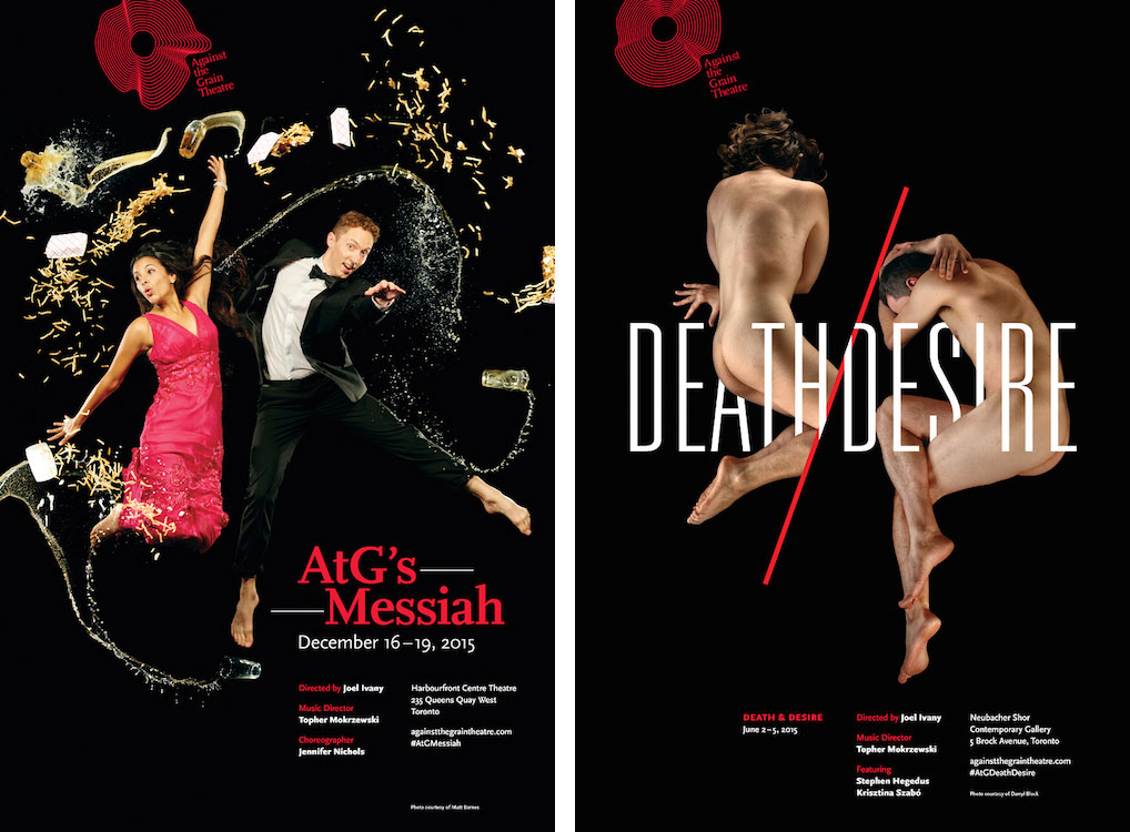
But that doesn’t easily translate to a visual representation. How do you capture the essence of AtG in a logo? Well, Michael had the answer. He played with references to wood grain, sound waves, vinyl grooves (records) and the letter “O”, and eventually came up with the bent design you see here. The design also exists in many changeable variations — a riff on the fluid nature of our company, which performs unconventional productions in unconventional spaces. Cool, right?
AtG offers its deepest thanks to Michael, who really hit this out of the park for us. What do you think? Share your thoughts with @AtGTheatre on Twitter, Instagram and Facebook.
*Our cheeky bird may still make an appearance from time to time.